棒グラフ02(家計調査)

ggplot2,reshape2 , RColorBrewer パッケージ

barplot関数、plot(type=”h”)、ggplot2::geom_bar の3通りの方法で棒グラフを作成。

(データ)
家計調査(家計収支編) 時系列データ(二人以上の世帯)

  1. 長期時系列データ(年)
    18-2 1世帯当たり年平均1か月間の収入と支出-二人以上の世帯うち勤労者世帯(平成12年~27年)(全国)(エクセル:74KB)より

(過去の記事)
棒グラフ01(家計調査)

積み上げ棒グラフ

データの読み込み、指数表記の回避:options(scipen=10)

1
2
3
4
5
6
7
8
9
10
11
12
13
14
15
16
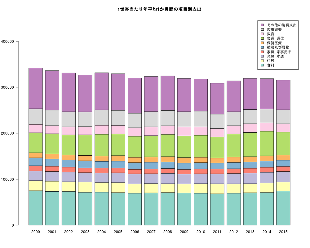
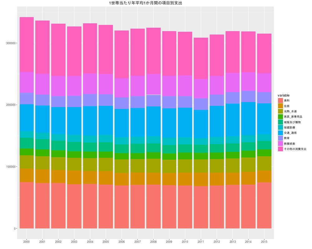
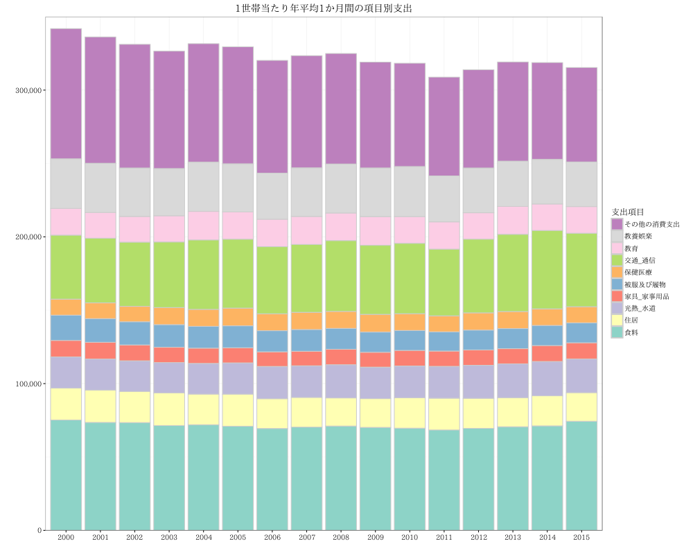
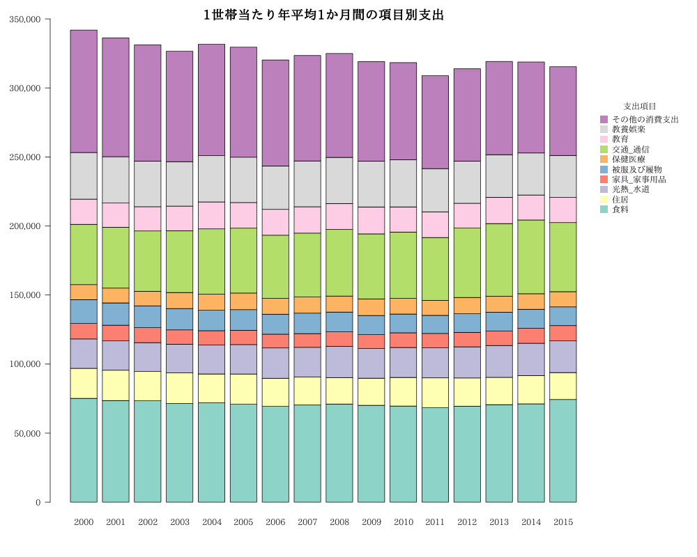
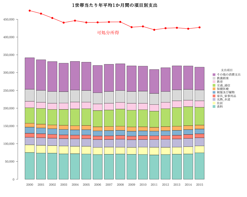
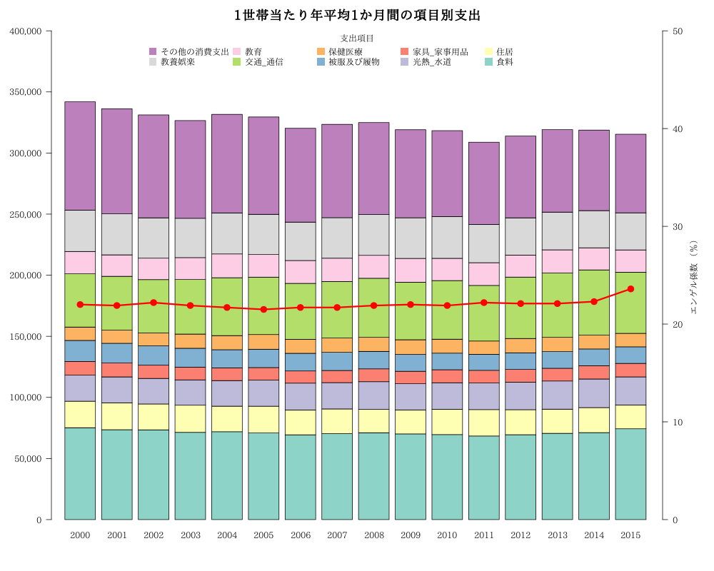
Year<-c("2000","2001","2002","2003","2004","2005","2006","2007","2008","2009","2010","2011","2012","2013","2014","2015")
食料<-c(75174,73558,73434,71394,71935,70947,69403,70352,71051,70134,69597,68420,69469,70586,71189,74341)
住居<-c(21716,21978,21200,22222,20877,21839,20292,20207,19156,19614,20694,21600,20479,19775,20467,19477)
光熱_水道<-c(21282,21228,20894,20718,20950,21328,21998,21555,22666,21466,21704,21742,22511,23077,23397,22971)
家具_家事用品<-c(11268,11359,10819,10427,10392,10313,9954,9914,10501,10152,10638,10406,10484,10385,10868,11047)
被服及び履物<-c(17195,16156,15807,15444,14867,14971,14430,14846,14263,13773,13573,13103,13552,13715,13730,13561)
保健医療<-c(10901,10748,10511,11603,11545,12035,11463,11697,11593,12036,11398,10880,11721,11596,11279,11015)
交通_通信<-c(43632,44054,43730,44730,47356,46986,45769,46259,48259,47093,48002,45488,50233,52595,53405,50035)
教育<-c(18261,17569,17544,17857,19482,18561,18713,19090,18789,19493,18195,18611,17992,19027,18094,18240)
教養娯楽<-c(33796,33537,33008,32181,33549,32847,31421,33166,33390,33243,34160,31296,30506,30861,30435,30364)
その他の消費支出<-c(88670,86023,84252,79991,80683,79671,76786,76372,75260,72055,70353,67293,66926,67554,65890,64329)
#
#データフレーム作成
kakei<-data.frame(Year,食料,住居,光熱_水道,家具_家事用品,被服及び履物,保健医療,交通_通信,教育,教養娯楽,その他の消費支出)
# scipenによって指数表記を回避
options(scipen=10)
(とりあえず)barplot 関数
1
2
3
4
5
6
library(RColorBrewer)
cols<-brewer.pal(ncol(kakei)-1, "Set3")
#png("bar20.png",width=1000,height=800)
barplot(t(as.matrix(kakei[,-1])),names.arg=kakei[,1],ylim=c(0,450000),col=cols,las=1,legend.text=colnames(kakei[,-1]))
title("1世帯当たり年平均1か月間の項目別支出")
#dev.off()

ggplot2
1
2
3
4
5
6
7
8
9
10
11
library(ggplot2)
library(reshape2)
#options(digits=16)
#options(scipen=10)
df <- melt(kakei) # Yearのみ文字列であることに注意
g <- ggplot(df,aes (x =Year,y =value,fill =variable ))
g <- g + geom_bar(stat = "identity")
g <- g + labs(x="",y="",title="1世帯当たり年平均1か月間の項目別支出")
#png("bar21.png",width=1000,height=800)
g
#dev.off()

修飾をプラス
1
2
3
4
5
6
7
8
9
10
g <- g + geom_bar(stat = "identity",colour="gray80")
g <- g + guides(fill = guide_legend(reverse = TRUE,title="支出項目"))
g <- g + scale_fill_brewer(palette = "Set3")
g <- g + theme_bw()
#g <- g + scale_y_continuous(expand = c(0,0),limits=c(0,NA))
g <- g + scale_y_continuous(expand =c(0,0),limits=c(0,350000),breaks = c(0,100000,200000,300000),labels = c("0","100,000", "200,000", "300,000"))
g <- g + theme(text=element_text(size=12,family="TakaoExMincho"))
#png("bar22.png",width=1000,height=800)
g
#dev.off()

(修飾プラス)barplot 関数
1
2
3
4
5
6
7
8
9
10
11
12
13
14
15
16
17
#options(scipen=10)
library(RColorBrewer)
cols<-brewer.pal(ncol(kakei)-1, "Set3")
#png("bar23.png",width=1000,height=800)
# 右側に余白を開ける
par(mar=c(5,5,3,10))
# 枠外への描画を許可
par(xpd=T)
# フォントを指定(ubuntuの場合)
par(family="TakaoExMincho")
barplot(t(as.matrix(kakei[,-1])),names.arg=kakei[,1],col=cols,yaxt="n")
axis(2,at=seq(0,350000,50000),labels = c("0","50,000","100,000","150,000", "200,000","250,000", "300,000","350,000"),las=1)
# 座標を取得 - par()$usr[2]:右端, par()$usr[4]:上
legend(par()$usr[2], par()$usr[4]-50000, legend=rev(colnames(kakei[,-1])),col=rev(cols),pch=15,pt.cex=2,title="支出項目",box.lty=0)
title("1世帯当たり年平均1か月間の項目別支出",cex.main=1.5)
#box()
#dev.off()

ここからは、barplot 関数のみ使用

y軸が共通な折れ線グラフを加える

1
2
3
4
5
6
7
8
9
10
11
12
13
14
15
16
17
18
19
20
21
22
#折れ線グラフのデータは、可処分所得
可処分所得<-c(474411,466003,453716,440667,446288,441156,441448,442504,442749,427912,429967,420538,425005,426132,423541,427270)
options(scipen=10)
library(RColorBrewer)
cols<-brewer.pal(ncol(kakei)-1, "Set3")
#png("bar24.png",width=1000,height=800)
# 右側に余白を開ける
par(mar=c(5,5,3,10))
# 枠外への描画を許可
par(xpd=T)
# フォントを指定(ubuntuの場合)
par(family="TakaoExMincho")
b<-barplot(t(as.matrix(kakei[,-1])),names.arg=kakei[,1],ylim=c(0,max(可処分所得)),col=cols,yaxt="n")
axis(2,at=seq(0,450000,50000),labels = c("0","50,000","100,000","150,000", "200,000","250,000", "300,000","350,000","400,000","450,000"),las=1)
# 座標を取得 - par()$usr[2]:右端, par()$usr[4]:上
legend(par()$usr[2], par()$usr[4]-160000, legend=rev(colnames(kakei[,-1])),col=rev(cols),pch=15,pt.cex=2,title="支出項目",box.lty=0)
title("1世帯当たり年平均1か月間の項目別支出",cex.main=1.5)
#box()
lines(x=b,y=可処分所得,col="red",lwd=2)
points(x=b,y=可処分所得,pch=20,col="red",cex=2)
text(9,min(可処分所得),"可処分所得",pos=1,cex =1.5,col="red")
#dev.off()

棒グラフのy軸とは異なる軸の折れ線グラフを加える(2軸)

1
2
3
4
5
6
7
8
9
10
11
12
13
14
15
16
17
18
19
20
21
22
#折れ線グラフのデータは、エンゲル係数
エンゲル係数<-c(22.0,21.9,22.2,21.9,21.7,21.5,21.7,21.7,21.9,22.0,21.9,22.2,22.1,22.1,22.3,23.6)
options(scipen=10)
library(RColorBrewer)
cols<-brewer.pal(ncol(kakei)-1, "Set3")
#png("bar25.png",width=1000,height=800)
# 右側に余白を開ける
par(mar=c(5,5,3,5))
# 枠外への描画を許可
par(xpd=T)
# フォントを指定(ubuntuの場合)
par(family="TakaoExMincho")
b<-barplot(t(as.matrix(kakei[,-1])),names.arg=kakei[,1],col=cols,las=1,xlim=c(0.5,nrow(kakei)+3),ylim=c(0,400000),yaxt="n" )
axis(2,at=seq(0,400000,50000),labels = c("0","50,000","100,000","150,000", "200,000","250,000", "300,000","350,000","400,000"),las=1)
# 座標を取得 - par()$usr[2]:右端, par()$usr[4]:上
legend("top",legend=rev(colnames(kakei[,-1])),col=rev(cols),pch=15,pt.cex=2,title="支出項目",box.lty=0,ncol=5)
title("1世帯当たり年平均1か月間の項目別支出",cex.main=1.5)
par(new=TRUE)
plot(x=b,y=エンゲル係数,type="o",col="red",lwd=3,pch=20,cex=2,xlim=c(0.5,nrow(kakei)+3),ylim=c(0,50),xaxt="n",yaxt="n",xlab="",ylab="",bty="n",yaxs="i")
axis(4,las=1)
mtext("エンゲル係数 (%)",4,2.5)
#dev.off()