ggplot2, plotflowパッケージ
barplot関数、plot(type=”h”)、ggplot2::geom_bar の3通りの方法で棒グラフを作成。
(データ)
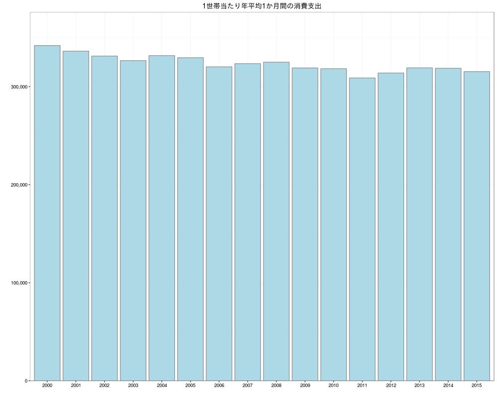
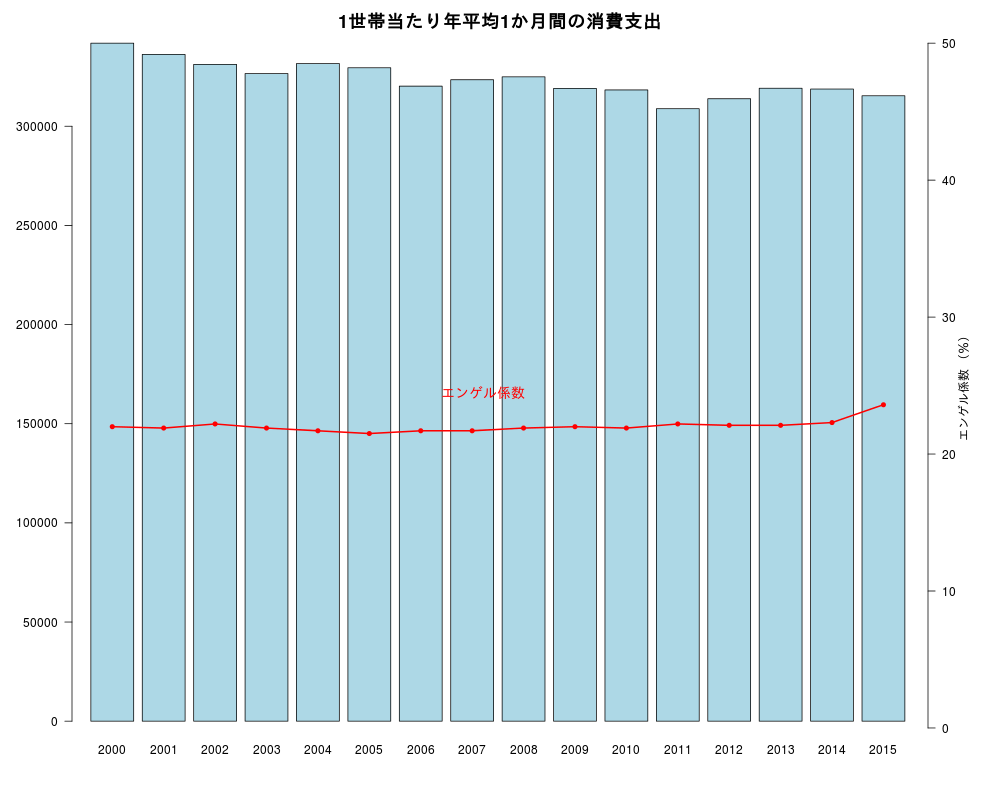
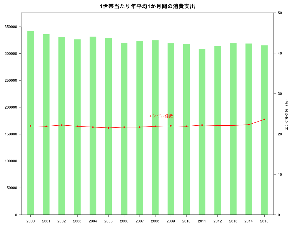
家計調査(家計収支編) 時系列データ(二人以上の世帯)
- 長期時系列データ(年)
18-2 1世帯当たり年平均1か月間の収入と支出-二人以上の世帯うち勤労者世帯(平成12年~27年)(全国)(エクセル:74KB)より
データの読み込み、指数表記の回避:options(scipen=10)
|
|
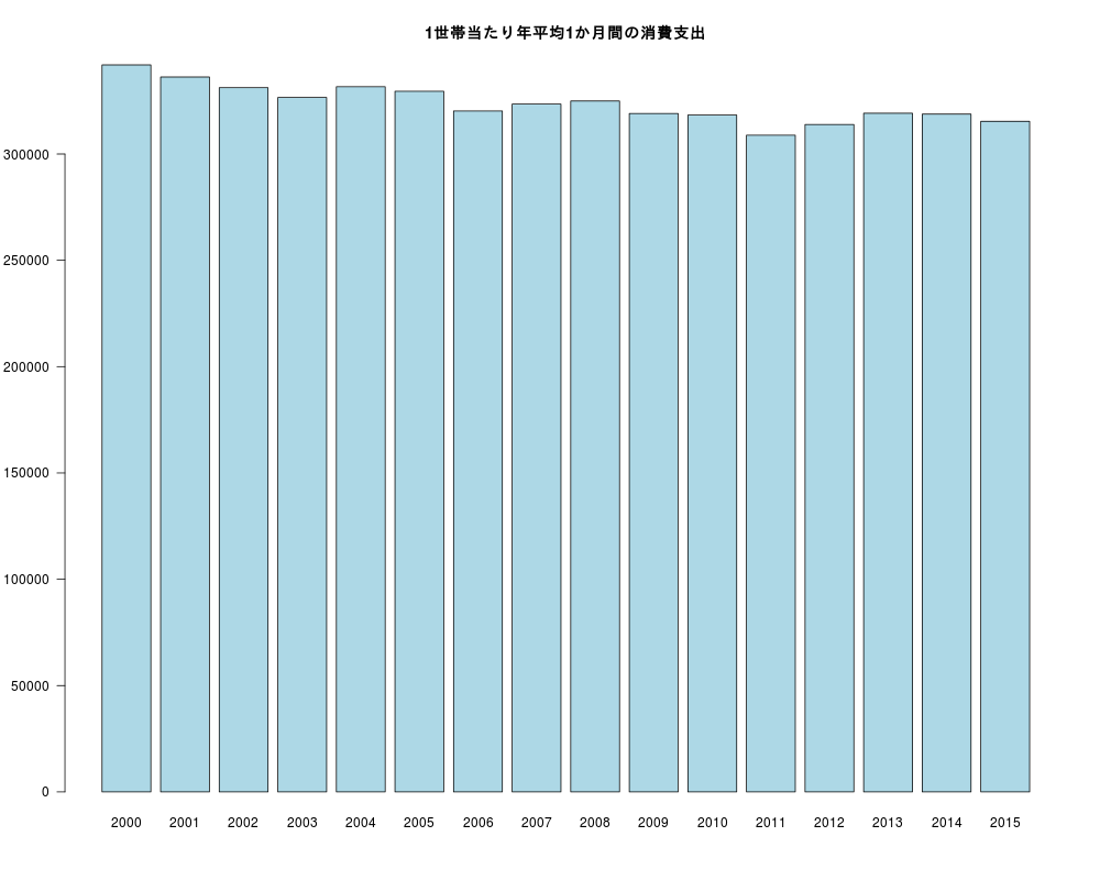
普通の棒グラフ
barplot 関数
|
|
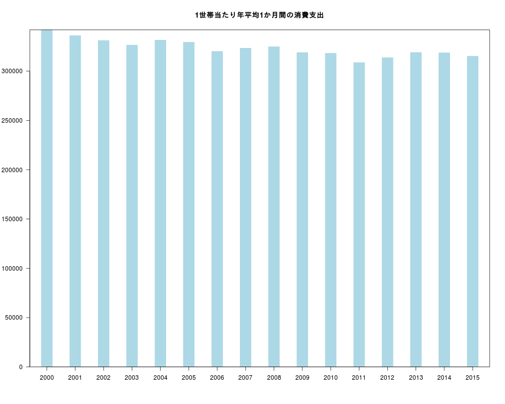
plot (type=”h”,lend=”butt” (またはlend=1) )
- lend=1 で棒の上部を平らにする。
- yaxs=”i” でy=0からx軸までの余白を消す。
|
|
ggplot2
|
|
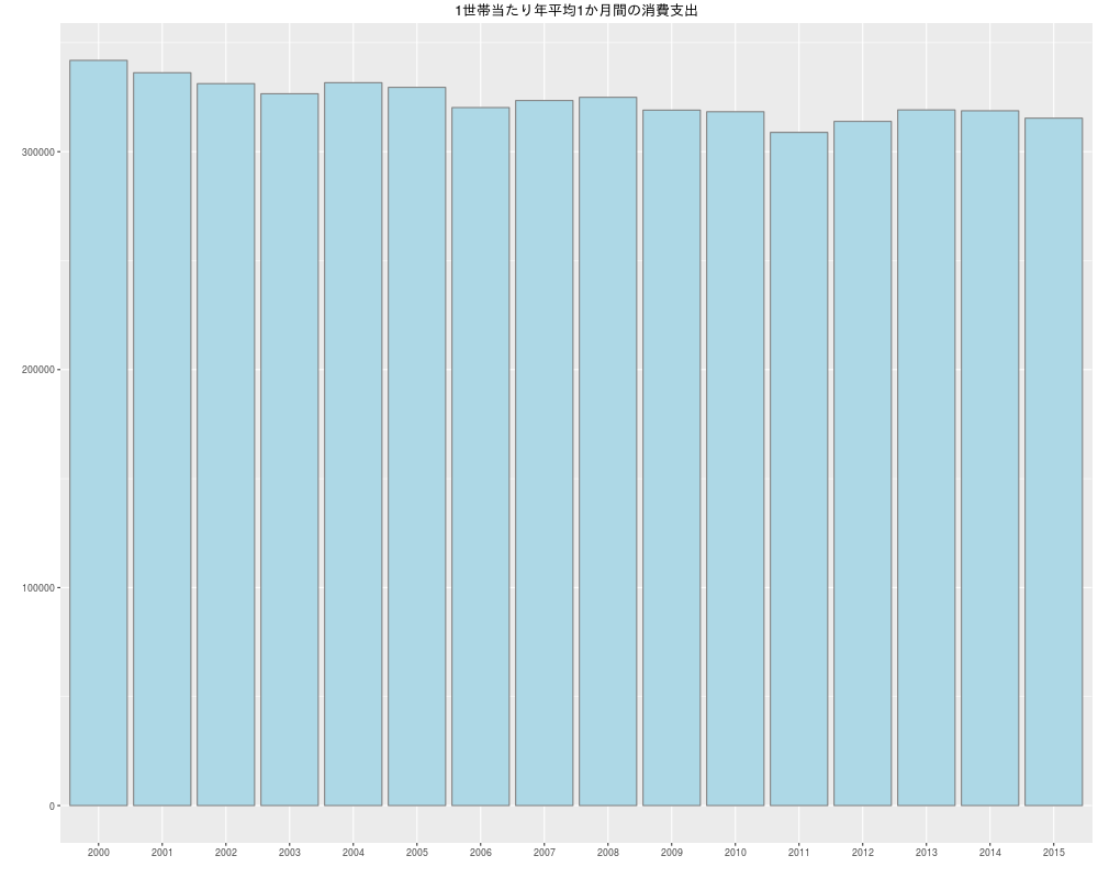
少し手を加える(y=0からx軸までの余白を消す等)
|
|
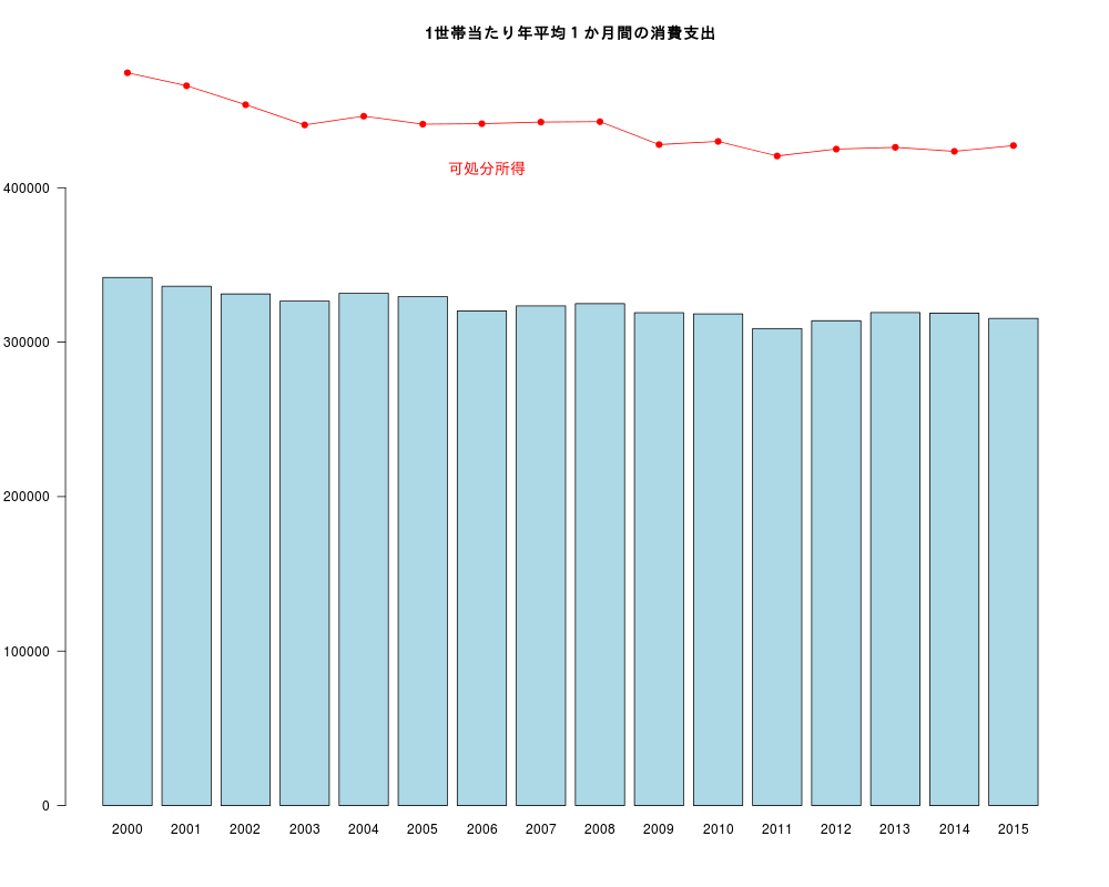
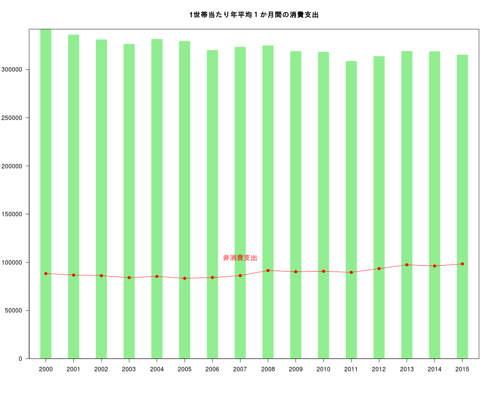
棒グラフにy軸が共通な折れ線グラフを加える
barplot 関数
- barplot の返り値を利用する
|
|
plot (type=”h”,lend=”butt” (またはlend=1) )
|
|
ggplot2
|
|
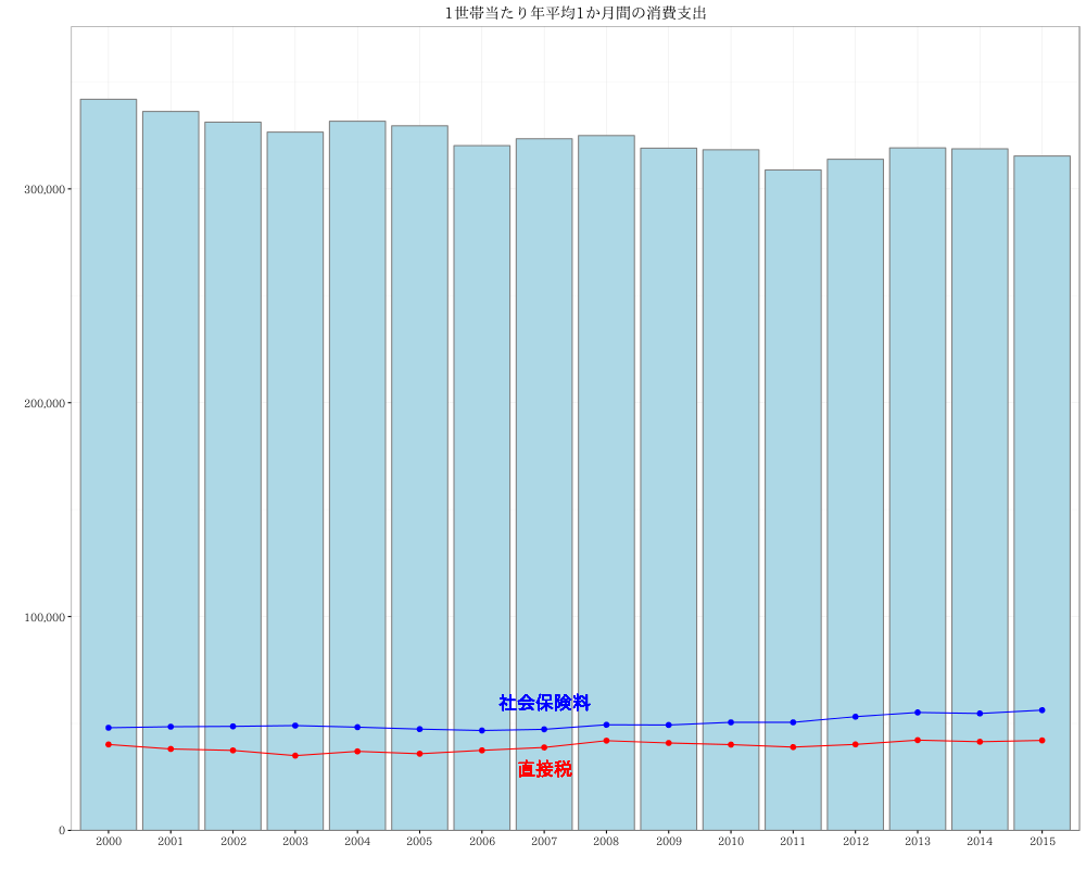
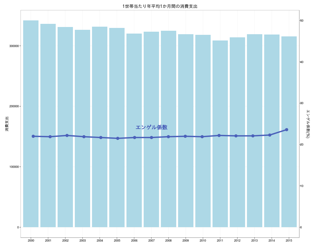
棒グラフのy軸とは異なる軸の折れ線グラフを加える(2軸)
折れ線グラフのデータはエンゲル係数(作成するグラフすべて)
|
|
barplot 関数
|
|
plot (type=”h”,lend=”butt” (またはlend=1) )
|
|
ggplot2
(参考)
Rで解析:ggplot2の利便性が向上「plotflow」パッケージ
|
|