放送大学「心理統計法」第2章 度数分布とその特徴
「問題解決の数理第6章 在庫管理」ABC分析 にも関連あり
ヒストグラム
|
|
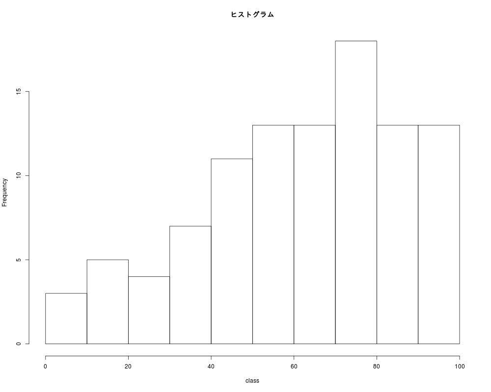
関数histの戻り値を使う
|
|
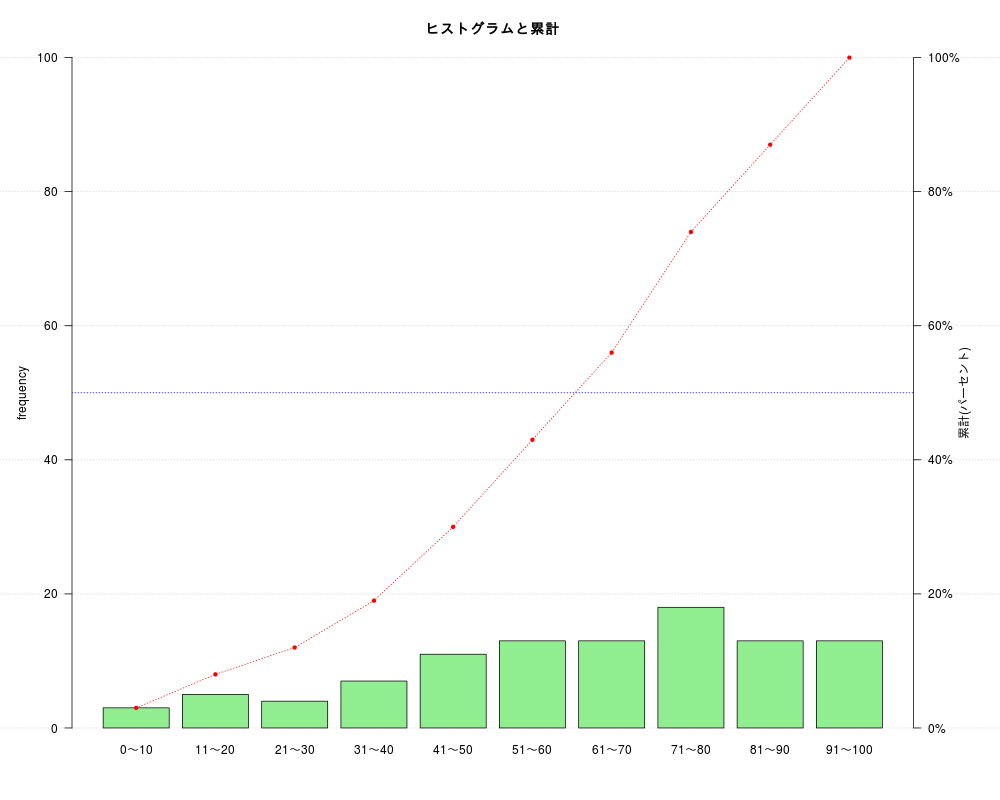
| class | freq |
|---|---|
| 0~10 | 3 |
| 11~20 | 5 |
| 21~30 | 4 |
| 31~40 | 7 |
| 41~50 | 11 |
| 51~60 | 13 |
| 61~70 | 13 |
| 71~80 | 18 |
| 81~90 | 13 |
| 91~100 | 13 |
|
|
kable関数で打ち出された表に文字列「class」を記入
| class | 0~10 | 11~20 | 21~30 | 31~40 | 41~50 | 51~60 | 61~70 | 71~80 | 81~90 | 91~100 |
|---|---|---|---|---|---|---|---|---|---|---|
| freq | 3 | 5 | 4 | 7 | 11 | 13 | 13 | 18 | 13 | 13 |
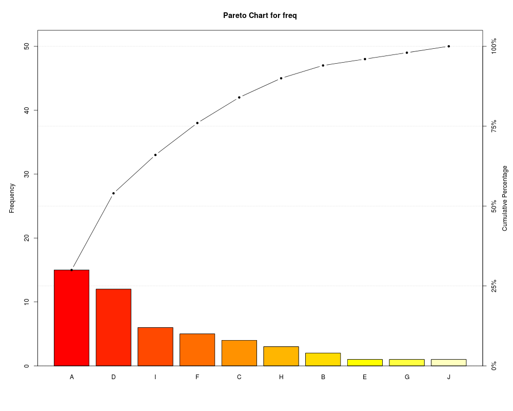
パレート図
その1(qccパッケージのpareto.chart)
|
|
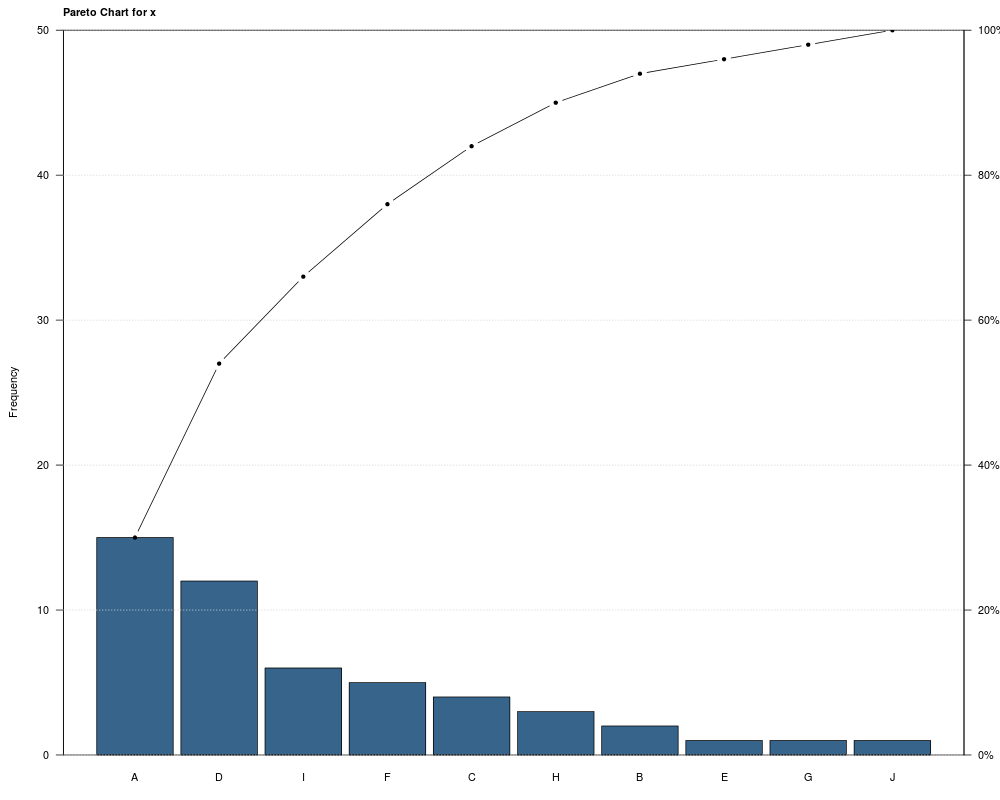
その2(qichartsパッケージのparetochart)
|
|
その3(関数を定義して使うときに調整する)
データフレームの1列目:クラスや選択肢、2列目:度数に固定
関数を定義
|
|
定義したabc.chart関数を使ってグラフ作成
|
|
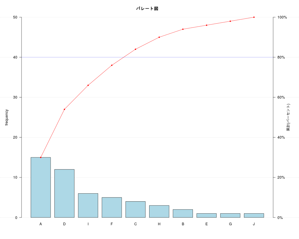
abc.chart関数を調整してこの記事の最初で作成したデータフレーム number_tableをグラフ化
(以下のとおり変更)
並べ替えしない。ヒストグラムの色を変える。折れ線を点線。80%lineを50%lineに。
|
|
調整して読み込み直したabc.chart関数を使ってグラフ作成
|
|