21世紀の資本グラフ1

Quandl、xts、lattice、gridExtra、plotrix、RColorBrewer パッケージ

「21世紀の資本」のデータが公開されてるのでRを使ってグラフ化してみます。
(グラフもすでに公開されているのであまり意味はありません。)
(参考)
Piketty Codes
『21世紀の資本』日本語版サポートページ

Chapter 1: Income and Output

(注意)TS1_1A ~ TS1_3B のQuandlデータ : Date “2011-08-19”、正しくは “0001-12-31”です。確認の上、訂正。

Distribution of World Output, AD1-2012
1
2
3
4
5
6
7
8
9
10
11
12
13
14
15
16
17
18
19
20
21
22
23
24
25
26
library(xts)
library(Quandl)
#Distribution of World Output, AD1-2012
TS1_1A<-Quandl("PIKETTY/TS1_1A")
#確認
TS1_1A
TS1_1A[11,1]<-"0001-12-31"
TS1_1A
#並べ替え
sortlist <- order(TS1_1A[,1])
dat <- TS1_1A[sortlist,]
TS1_1A<-dat
rownames(TS1_1A) <- c(1:nrow(TS1_1A))
#save("TS1_1A", file="TS1_1A.dat")
#load("TS1_1A.dat")
library("plotrix")
library(RColorBrewer)
#png("Piketty1_1A.png",width=1000,height=800)
stackpoly(TS1_1A[,3:6],ylim=c(0,100),axis4=F,main="世界産出の分配 1~2012年",col=brewer.pal(4,"Pastel1"),
xaxlab=c("0001","1000","1500","1700","1820","1870","1913","1950","1970","1990","2012"),border="gray36",staxx=F,stack=TRUE)
#boxed.labels(8,20,"Europe",border=F,ypad=1.8,bg="white")
#boxed.labels(8,55,"America",border=F,ypad=1.8)
#boxed.labels(3,33,"Africa",border=F,ypad=1.8)
#boxed.labels(4,70,"Asia",border=F,xpad=1.5,ypad=1.8)
boxed.labels(c(8,8,3,4),c(20,55,33,70),colnames(TS1_1A[3:6]),border=F,xpad=c(1.2,1.2,1.2,1.5),ypad=1.8)
#dev.off()

Detailed Data on the Distribution of World Output, AD1-2012
1
2
3
4
5
6
7
8
9
10
11
12
13
14
15
16
17
18
19
20
21
22
23
24
25
26
27
28
library(xts)
library(Quandl)
TS1_1B<-Quandl("PIKETTY/TS1_1B")
#確認
TS1_1B
TS1_1B[11,1]<-"0001-12-31"
TS1_1B
#並べ替え
sortlist <- order(TS1_1B[,1])
dat <- TS1_1B[sortlist,]
TS1_1B<-dat
rownames(TS1_1B) <- c(1:nrow(TS1_1B))
#save("TS1_1B", file="TS1_1B.dat")
#load("TS1_1B.dat")
#並べ替え(凡例をわかりやすくするため)
Date<-TS1_1B[,1]
d0<-TS1_1B[,-1]
TS1_1B<-data.frame(Date,d0[order(d0[nrow(d0),], decreasing = TRUE)])
rownames(TS1_1B) <- c(1:nrow(TS1_1B))
library(xts)
library(lattice)
TS1_1B.xts <- as.xts(read.zoo(TS1_1B))
#xyplot(TS1_1B.xts[,-1],superpose=TRUE,xlab="year",ylab="",main="世界産出の分配の詳細 1~2012年",lwd=2,grid = TRUE,
#auto.key=list(title="", space = "top", cex=0.8, columns = 3), scales = list( y = list( rot = 0 )))
#png("Piketty1_1B.png",width=1000,height=800)
xyplot(TS1_1B.xts["1820-12-31::",-1],superpose=TRUE,xlab="year",ylab="",main="世界産出の分配の詳細 1820~2012年",lwd=2,grid = TRUE,
auto.key=list(title="", space = "top", cex=0.8,columns = 3), scales = list( y = list( rot = 0 )))
#dev.off()

Distribution of the World Population, AD1-2012
1
2
3
4
5
6
7
8
9
10
11
12
13
14
15
16
17
18
19
20
21
22
library(xts)
library(Quandl)
TS1_2A<-Quandl("PIKETTY/TS1_2A")
#確認
TS1_2A
TS1_2A[11,1]<-"0001-12-31"
TS1_2A
#並べ替え
sortlist <- order(TS1_2A[,1])
dat <- TS1_2A[sortlist,]
TS1_2A<-dat
rownames(TS1_2A) <- c(1:nrow(TS1_2A))
#save("TS1_2A", file="TS1_2A.dat")
#load("TS1_2A.dat")
library("plotrix")
library(RColorBrewer)
#png("Piketty1_2A.png",width=1000,height=800)
stackpoly(TS1_2A[,3:6],ylim=c(0,100),axis4=F,main="世界の人口 1~2012年",col=brewer.pal(4,"Pastel1"),
xaxlab=c("0001","1000","1500","1700","1820","1870","1913","1950","1970","1990","2012"),border="gray36",staxx=F,stack=TRUE)
#簡潔に書くと、
boxed.labels(c(5,9,3,6),c(10,24,30,70),colnames(TS1_2A[3:6]),border=F,bg=NA,col="gray20",cex=2)
#dev.off()

Detailed Data on the Distribution of World Population, Ad1-2012
1
2
3
4
5
6
7
8
9
10
11
12
13
14
15
16
17
18
19
20
21
22
23
24
25
library(xts)
library(Quandl)
TS1_2B<-Quandl("PIKETTY/TS1_2B")
TS1_2B
TS1_2B[11,1]<-"0001-12-31"
TS1_2B
#並べ替え
sortlist <- order(TS1_2B[,1])
dat <- TS1_2B[sortlist,]
TS1_2B<-dat
rownames(TS1_2B) <- c(1:nrow(TS1_2B))
#save("TS1_2B", file="TS1_2B.dat")
#load("TS1_2B.dat")
#並べ替え(凡例をわかりやすくするため)
Date<-TS1_2B[,1]
d0<-TS1_2B[,-1]
TS1_2B<-data.frame(Date,d0[order(d0[nrow(d0),], decreasing = TRUE)])
rownames(TS1_2B) <- c(1:nrow(TS1_2B))
library(xts)
library(lattice)
TS1_2B.xts <- as.xts(read.zoo(TS1_2B))
#png("Piketty1_2B.png",width=1000,height=800)
xyplot(TS1_2B.xts[,-1],superpose=TRUE,xlab="year",ylab="",main="世界の人口の詳細 1~2012年",lwd=2,grid = TRUE,
auto.key=list(title="", space = "top", cex=0.8,columns = 3), scales = list( y = list( rot = 0 )))
#dev.off()

Relative Per Capita GDP by Continent, AD1-2012
1
2
3
4
5
6
7
8
9
10
11
12
13
14
15
16
17
18
19
20
21
22
23
24
25
26
27
28
29
library(xts)
library(Quandl)
TS1_3A<-Quandl("PIKETTY/TS1_3A")
TS1_3A
TS1_3A[11,1]<-"0001-12-31"
TS1_3A
#並べ替え
sortlist <- order(TS1_3A[,1])
dat <- TS1_3A[sortlist,]
TS1_3A<-dat
rownames(TS1_3A) <- c(1:nrow(TS1_3A))
#save("TS1_3A", file="TS1_3A.dat")
#load("TS1_3A.dat")
#並べ替え(凡例をわかりやすくするため)
Date<-TS1_3A[,1]
d0<-TS1_3A[,-1]
TS1_3A<-data.frame(Date,d0[order(d0[nrow(d0),], decreasing = TRUE)])
rownames(TS1_3A) <- c(1:nrow(TS1_3A))
library(xts)
library(lattice)
TS1_3A.xts <- as.xts(read.zoo(TS1_3A))
library(gridExtra)
#png("Piketty1_3A.png",width=1200,height=800)
p1<-xyplot(TS1_3A.xts[,c(2,4,6)],superpose=TRUE,xlab="year",ylab="1人当たりGDP(世界平均のパーセント)",main="世界の格差 1-2012年",lwd=2,grid = TRUE,
auto.key=list(title="", space = "top", cex=0.8), scales = list( y = list( rot = 0 )))
p2<-xyplot(TS1_3A.xts[,c(1,3,4,5,7)],superpose=TRUE,xlab="year",ylab="1人当たりGDP(世界平均のパーセント)",main="世界の格差 1-2012年",lwd=2,grid = TRUE,
auto.key=list(title="", space = "top", cex=0.8,columns = 2), scales = list( y = list( rot = 0 )))
grid.arrange(p1,p2,ncol=2)
#dev.off()

Per Capita GDP by Global Region, AD1-2012
1
2
3
4
5
6
7
8
9
10
11
12
13
14
15
16
17
18
19
20
21
22
23
24
25
26
27
library(xts)
library(Quandl)
TS1_3B<-Quandl("PIKETTY/TS1_3B")
TS1_3B
TS1_3B[11,1]<-"0001-12-31"
TS1_3B
#並べ替え
sortlist <- order(TS1_3B[,1])
dat <- TS1_3B[sortlist,]
TS1_3B<-dat
rownames(TS1_3B) <- c(1:nrow(TS1_3B))
#save("TS1_3B", file="TS1_3B.dat")
#load("TS1_3B.dat")
#並べ替え(凡例をわかりやすくするため)
Date<-TS1_3B[,1]
d0<-TS1_3B[,-1]
TS1_3B<-data.frame(Date,d0[order(d0[nrow(d0),], decreasing = TRUE)])
rownames(TS1_3B) <- c(1:nrow(TS1_3B))
library(xts)
library(lattice)
TS1_3B.xts <- as.xts(read.zoo(TS1_3B))
#xyplot(TS1_3B.xts,superpose=TRUE,xlab="year",ylab="",main="一人当たりGDP 1~2012年",lwd=2,grid = TRUE,
#auto.key=list(title="", space = "right", cex=0.8, just = 0.95), scales = list( y = list( rot = 0 )))
#png("Piketty1_3B.png",width=1200,height=800)
xyplot(TS1_3B.xts["1820-12-31::"],superpose=TRUE,xlab="year",ylab="",main="一人当たりGDP 1820~2012年",lwd=2,grid = TRUE,
auto.key=list(title="", space = "right", cex=0.8, just = 0.95), scales = list( y = list( rot = 0 )))
#dev.off()

Eruo Exchange Rates and Purchasing Power Parity, 1990-2012
1
2
3
4
5
6
7
8
9
10
11
12
13
14
15
16
17
18
19
20
21
22
23
24
25
26
27
28
29
30
31
32
33
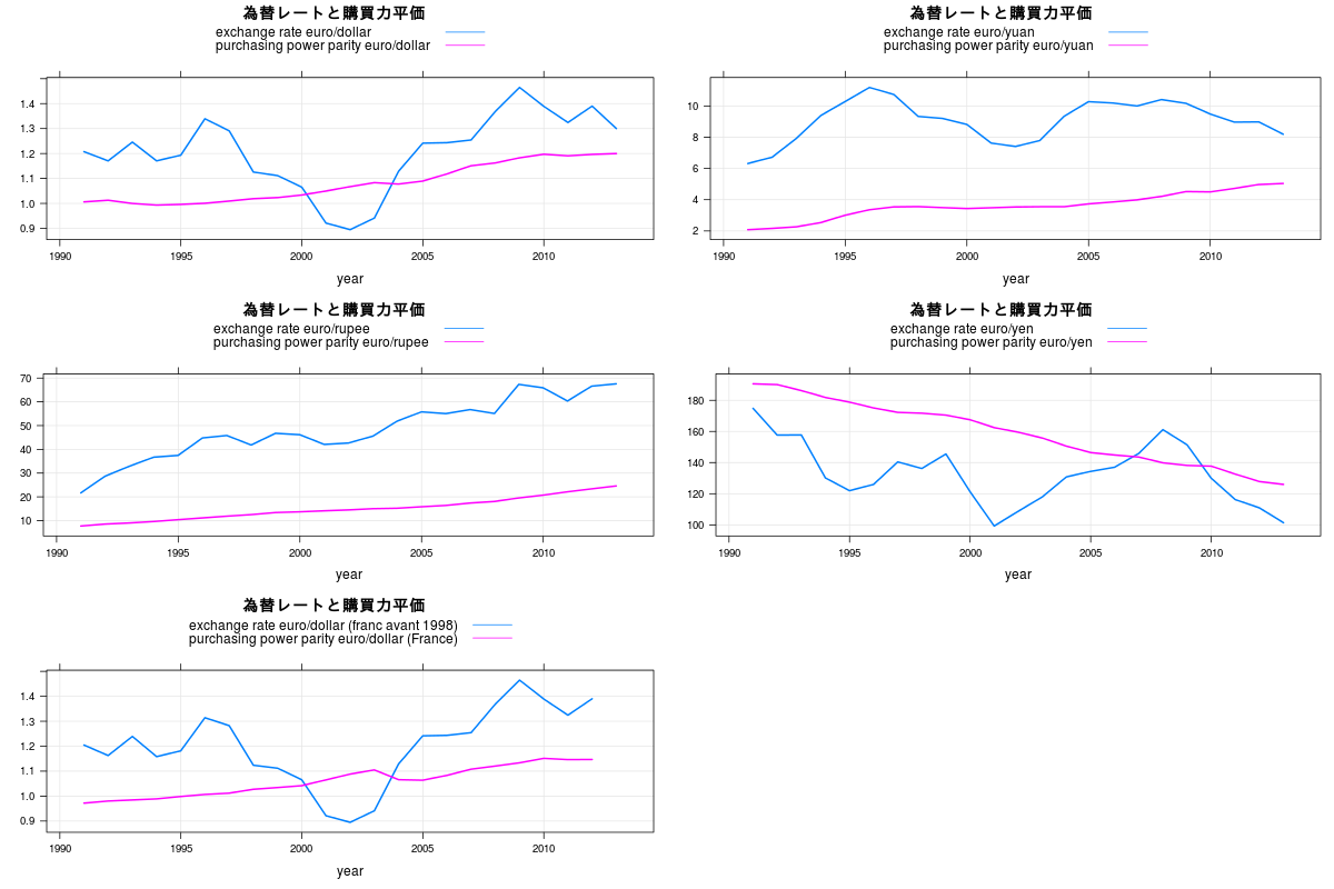
library(xts)
library(Quandl)
TS1_7<-Quandl("PIKETTY/TS1_7")
#exchange.rate : 為替レート
#purchasing.power.parity(PPP) : 購買力平価
#並べ替え
sortlist <- order(TS1_7[,1])
dat <- TS1_7[sortlist,]
TS1_7<-dat
rownames(TS1_7) <- c(1:nrow(TS1_7))
#save("TS1_7", file="TS1_7.dat")
#load("TS1_7.dat")
library(lattice)
library(gridExtra)
TS1_7.xts <- as.xts(read.zoo(TS1_7))
#並べ替え 為替レート : 1~10 購買力平価 : 11~20
TS<-TS1_7.xts[,c(1,3,5,7,9,10,11,15,17,19,2,4,6,8,12,13,14,16,18,20)]
#png("ER_PPP01.png",width=1200,height=800)
p1<-xyplot(TS[,c(1,11)],superpose=TRUE,xlab="year",ylab="",main="為替レートと購買力平価",lwd=2,grid = TRUE,scales = list( y = list( rot = 0 )))
p2<-xyplot(TS[,c(2,12)],superpose=TRUE,xlab="year",ylab="",main="為替レートと購買力平価",lwd=2,grid = TRUE,scales = list( y = list( rot = 0 )))
p3<-xyplot(TS[,c(3,13)],superpose=TRUE,xlab="year",ylab="",main="為替レートと購買力平価",lwd=2,grid = TRUE,scales = list( y = list( rot = 0 )))
p4<-xyplot(TS[,c(4,14)],superpose=TRUE,xlab="year",ylab="",main="為替レートと購買力平価",lwd=2,grid = TRUE,scales = list( y = list( rot = 0 )))
p5<-xyplot(TS[,c(5,15)],superpose=TRUE,xlab="year",ylab="",main="為替レートと購買力平価",lwd=2,grid = TRUE,scales = list( y = list( rot = 0 )))
grid.arrange(p1,p2,p3,p4,p5,ncol=2)
#dev.off()
#png("ER_PPP02.png",width=1200,height=800)
p1<-xyplot(TS[,c(6,16)],superpose=TRUE,xlab="year",ylab="",main="為替レートと購買力平価",lwd=2,grid = TRUE,scales = list( y = list( rot = 0 )))
p2<-xyplot(TS[,c(7,17)],superpose=TRUE,xlab="year",ylab="",main="為替レートと購買力平価",lwd=2,grid = TRUE,scales = list( y = list( rot = 0 )))
p3<-xyplot(TS[,c(8,18)],superpose=TRUE,xlab="year",ylab="",main="為替レートと購買力平価",lwd=2,grid = TRUE,scales = list( y = list( rot = 0 )))
p4<-xyplot(TS[,c(9,19)],superpose=TRUE,xlab="year",ylab="",main="為替レートと購買力平価",lwd=2,grid = TRUE,scales = list( y = list( rot = 0 )))
p5<-xyplot(TS[,c(10,20)],superpose=TRUE,xlab="year",ylab="",main="為替レートと購買力平価",lwd=2,grid = TRUE,scales = list( y = list( rot = 0 )))
grid.arrange(p1,p2,p3,p4,p5,ncol=2)
#dev.off()


おまけ:列名を短くし、
為替レートデータと購買力平価データを分ける

1
2
3
4
5
6
7
8
ER<-TS1_7.xts[,c(1,3,5,7,9,10,11,15,17,19)]
PPP<-TS1_7.xts[,-c(1,3,5,7,9,10,11,15,17,19)]
colnames(ER)<-c("ER euro/dollar","ER euro/yuan", "ER euro/rupee",
"ER euro/yen", "ER euro/dollar (franc avant 1998)", "ER euro/dollar (mark avant 1998)" ,
"ER euro/dollar (lire avant 1998)","ER dollar/yuan","ER dollar/rupee","ER dollar/yen")
colnames(PPP)<-c("PPP euro/dollar", "PPP euro/yuan", "PPP euro/rupee", "PPP euro/yen",
"PPP euro/dollar (France)", "PPP euro/dollar (Germany)", "PPP euro/dollar (Italy)",
"PPP dollar/yuan", "PPP dollar/rupee", "PPP dollar/yen")